Design system options for Rails
You would think that picking a well-made design system for your application is a solved task in 2025. But not for Rails and therefore not for Business Class. When I started Business Class, there wasn’t really a thing to adopt and somehow it still feels the same.
Building design systems
I am not a big designer, although I do try to improve in this regard (I bought the book Refactoring UI from the authors of Tailwind, among other things) and I have been part of implementing a design system a few times. The last time we were implementing it from scratch for Phrase with ViewComponent library.
I was originally thinking that Business Class should just adopt something that’s already out there, because building things from scratch are super time-consuming. However, the choices weren’t convincing at the time and I just started with Bulma. Later with the release of Tailwind 3 I made a switch and build a simple design with plain Tailwind and @apply.
I think the basic design works well, but it’s not a component design system people might expect to work with in 2025. So let’s reevaluate our options for the future and if we can finally pick something already made.
Component systems for Rails
There are still only a couple of options we can truly consider for Business Class. Please note that I can only include free or at least freemium design systems, not paid ones.
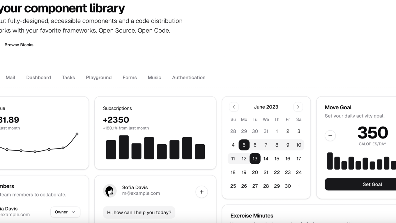
shadcn/ui
Shadcn/UI is an open-source collection of beautifully designed, reusable UI components built on top of React, Tailwind CSS, and Radix UI. It provides clean, accessible, and customizable building blocks that help developers quickly create modern web applications. Shadcn/UI emphasizes simplicity, developer experience, and adherence to industry-standard best practices, making it easy to integrate into various projects and workflows.

Since it’s made for React you would use it like this:
import {
Accordion,
AccordionContent,
AccordionItem,
AccordionTrigger,
} from "@/components/ui/accordion"
export function AccordionDemo() {
return (
<Accordion type="single" collapsible className="w-full">
<AccordionItem value="item-1">
<AccordionTrigger>Is it accessible?</AccordionTrigger>
<AccordionContent>
Yes. It adheres to the WAI-ARIA design pattern.
</AccordionContent>
</AccordionItem>
<AccordionItem value="item-2">
<AccordionTrigger>Is it styled?</AccordionTrigger>
<AccordionContent>
Yes. It comes with default styles that matches the other
components' aesthetic.
</AccordionContent>
</AccordionItem>
<AccordionItem value="item-3">
<AccordionTrigger>Is it animated?</AccordionTrigger>
<AccordionContent>
Yes. It's animated by default, but you can disable it if you prefer.
</AccordionContent>
</AccordionItem>
</Accordion>
)
}
If we want to use it in Rails, we have to provide our own implementation.
shadcn/ui on Rails
The original shadcn/ui is made for React and won’t help us that much for a plain Hotwire-based apps. Luckily someone already started shadcn/ui on Rails, the shadcn/ui implementation with helpers, partials, and Stimulus controllers.
At first, this looks perfect. Getting a Rails version of a mature project is a win in itself, but the ability to build hybrid apps with React and use the same system is even better. However, that’s a first look. The second look will reveal that it’s not complete and 1:1 version of the original.
Here’s how it looks like to use a component in a view:
<% items = [{:value => "Ruby on Rails", name: "Ruby on Rails"}, {:value => "Next.js", name: "Next.js"}, {:value => "Remix.run", name: "Remix.run"}] %>

<%= render_combobox items do %>
  <%= combobox_trigger do %>
    Select framework
  <% end %>
<% end %>
Still, I like the decision of using partials and Stimulus controllers and having everything wrapped in helpers. It’s in and out a very Railsy approach. It’s a strong contender.
daisyUI
Another component library for Tailwind CSS is daisyUI, designed to streamline web development by providing customizable, ready-to-use UI components. It’s one of the most used alternatives to shadcn/ui with a decent history of its own.

daisyUI implements Tailwind class names
for all common UI components so in practice we can use nice shortcuts like btn or
card. It’s little bit like Bootstrap and Bulma but on Tailwind. Personally, I appreciate the short class names and not polluting the HTML.
Here’s an example:
<div class="avatar">
  <div class="w-24 rounded-xl">
    <img src="https://img.daisyui.com/images/stock/photo-1534528741775-53994a69daeb.webp" />
  </div>
</div>
<div class="avatar">
  <div class="w-24 rounded-full">
    <img src="https://img.daisyui.com/images/stock/photo-1534528741775-53994a69daeb.webp" />
  </div>
</div>
The latest daisyUI 5 that builds on Taiwind 4 looks really nice and offers a lot of nice prebuilt themes:

The biggest downside is that DaisyUI doesn’t ship with JavaScript. It’s primarily a visual system.
Flowbite
Flowbite is an open-source UI library built upon Tailwind CSS, offering a collection of various components and utilities to streamline the development of responsive and modern web applications.

What I like is that Flowbite officially support several framework including Rails. The JavaScript is generic and not React-specific. This alone is very nice since we don’t need to reimplement anything ourselves.
Here’s a snippet of a component in Flowbite:
<!-- Modal toggle -->
<div class="flex justify-center m-5">
    <button id="updateProductButton" data-modal-target="updateProductModal" data-modal-toggle="updateProductModal" class="block text-white bg-primary-700 hover:bg-primary-800 focus:ring-4 focus:outline-none focus:ring-primary-300 font-medium rounded-lg text-sm px-5 py-2.5 text-center dark:bg-primary-600 dark:hover:bg-primary-700 dark:focus:ring-primary-800" type="button">
    Update product
    </button>
</div>

<!-- Main modal -->
<div id="updateProductModal" tabindex="-1" aria-hidden="true" class="hidden overflow-y-auto overflow-x-hidden fixed top-0 right-0 left-0 z-50 justify-center items-center w-full md:inset-0 h-modal md:h-full">
    <div class="relative p-4 w-full max-w-2xl h-full md:h-auto">
        <!-- Modal content -->
        <div class="relative p-4 bg-white rounded-lg shadow dark:bg-gray-800 sm:p-5">
            <!-- Modal header -->
            <div class="flex justify-between items-center pb-4 mb-4 rounded-t border-b sm:mb-5 dark:border-gray-600">
                <h3 class="text-lg font-semibold text-gray-900 dark:text-white">
                    Update Product
                </h3>
                <button type="button" class="text-gray-400 bg-transparent hover:bg-gray-200 hover:text-gray-900 rounded-lg text-sm p-1.5 ml-auto inline-flex items-center dark:hover:bg-gray-600 dark:hover:text-white" data-modal-toggle="updateProductModal">
                    <svg aria-hidden="true" class="w-5 h-5" fill="currentColor" viewBox="0 0 20 20" xmlns="http://www.w3.org/2000/svg"><path fill-rule="evenodd" d="M4.293 4.293a1 1 0 011.414 0L10 8.586l4.293-4.293a1 1 0 111.414 1.414L11.414 10l4.293 4.293a1 1 0 01-1.414 1.414L10 11.414l-4.293 4.293a1 1 0 01-1.414-1.414L8.586 10 4.293 5.707a1 1 0 010-1.414z" clip-rule="evenodd"></path></svg>
                    <span class="sr-only">Close modal</span>
                </button>
            </div>
As you can see you use the Tailwind directly together with data attributes and aria labels. Here’s a corresponding JavaScript we need to add:
document.addEventListener("DOMContentLoaded", function(event) {
  document.getElementById('updateProductButton').click();
});
Unlike the previous options, Flowbite isn’t entirely open source. Still, the basic building blocks are and could be enough for a new Business Class theme.
Preline
Preline is another freemium UI library built upon Tailwind CSS with its own framework-independent JavaScript. It features a lot of components and examples, including those for building marketing pages and what not.

Here’s how an authentication box would look like in code with Preline:
“`html
RubyUI
So far, we looked at popular design systems and their use in Rails. But there is one significant effort being developed directly for Ruby called RubyUI. It’s also built on top of Tailwind and provides easy installation instructions for both JavaScript bundlers and Importmaps.

The whole project is really full of green flags, but it’s not without a potential downside. It’s a system made for Phlex, an alternative view layer for Ruby. If you have never heard about it, here’s how the component might look like:
AspectRatio(aspect_ratio: "4/3", class: "rounded-md overflow-hidden border shadow-sm") do
  img(
    alt: "Placeholder",
    loading: "lazy",
    src: image_path('pattern.jpg')
  )
end
It’s a pure Ruby component that will be included in pure Ruby view. So no ERB or anything like that. On one hand it’s pretty cool, on the other I am not 100% convinced to leave ERB for greener pastures. I always loved being able to just work inside HTML.
Conclusion
So what have we learned? The choices are a bit better than before, but there is not a single ultimate choice outshining the others. One thing is clear tho, going the Tailwind route was likely a good choice, and we should keep building on top of Tailwind whether that’s with a pre-made UI or Business Class own theme.