
A gentle introduction to anchor positioning
Anchor positioning allows you to place an element on the page based on where another element is. It makes it easier to create responsive menus and tooltips with less code using only CSS. Here’s how it works.
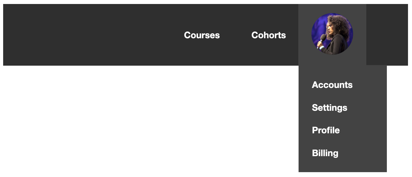
Let’s say you have an avatar in your nav, like this:

When you click the avatar, you want a menu to appear right below it. The clicking interaction can be handled with just CSS using the Popover API. But once you click, where does your menu show up?
Figuring this out typically requires some JavaScript. But now, with anchor positioning, you can accomplish this with just a few lines of CSS. Anchor positioning will use where the avatar is to determine where the menu will go.
For example, you might want to place it just below the avatar, nice and left-aligned, like this:
Or you can have it hang out on the side of the avatar, having a party off to the right, like this:
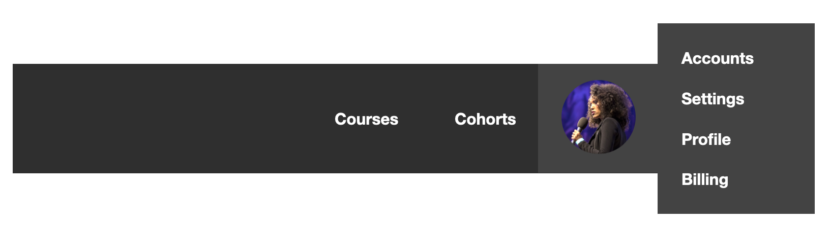
You can position it in a number of places, but I think that first example looks good. It’s something you’d frequently see on the web on sites and web apps. Let’s walk through the code of how to make it happen.
The first step in placing your menu is letting it know about your avatar.
A great way to think about the relationship between your avatar and your menu is to think of your menu as if it’s anchored to your avatar. With that in mind, we’ll refer to your avatar as your anchor and your menu as your target.
You’ll name your anchor by declaring an anchor-name on the avatar element. Since your avatar represents your profile and is behaving like button, let’s give it a class of profile-button.
Here’s what it looks like:
.profile-button {
  anchor-name: --profile-button;
}
Then you’ll go to your menu (your target) and declare a position-anchor where the value is the anchor-name of the anchor that you previously declared. This is what establishes the connection and tells the target about the anchor.
Let’s go to your target and declare it there:
.profile-menu {
  position-anchor: --profile-button;
}
And the final step is giving your menu an absolute or fixed position, like this:
.profile-menu {
  position-anchor: --profile-button;
  position: absolute;
}
Great, you’ve established your connection! Now you need to decide where to put your menu.
Position-area
One way to do this is to use the position-area property.
The position-area allows you to place your element on a nine-square grid where the anchor takes the center spot. The space that contains this grid is the containing block of the anchor.
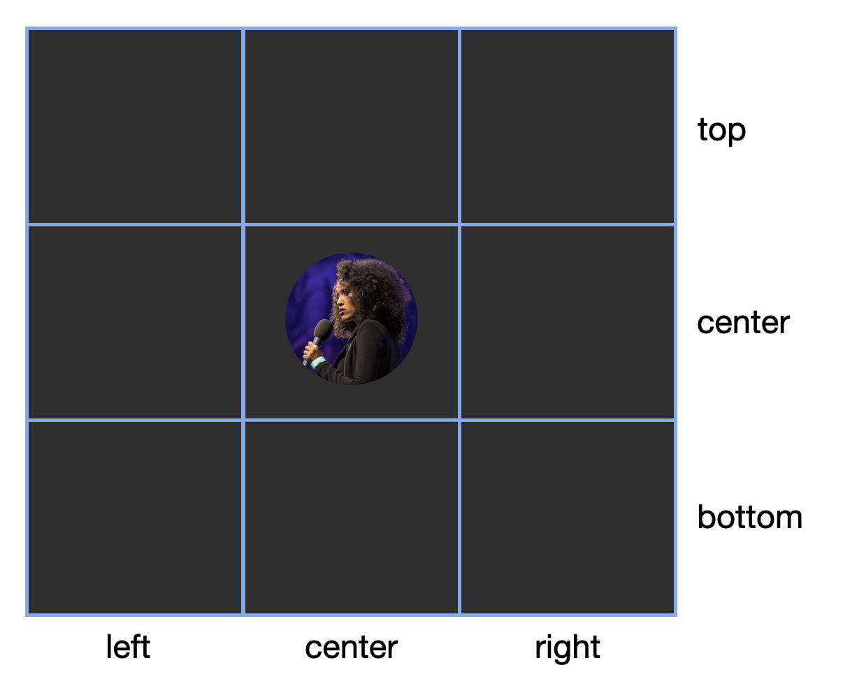
You can use this grid to determine where you want to position your menu. Do you want the menu to show up on the top right? Great! You can write top right.
.profile-menu {
  position-anchor: --profile-button;
  position: absolute;
  position-area: top right;
}

But here’s the thing about top right — it might feel like an intuitive way to describe where you want your target to be placed, but it’s actually not the best way to go about it.
Whenever possible, you want to use logical properties, not physical ones, in your CSS. That’s a more inclusive way to describe what you’re trying to do that doesn’t make assumptions about writing mode or language.
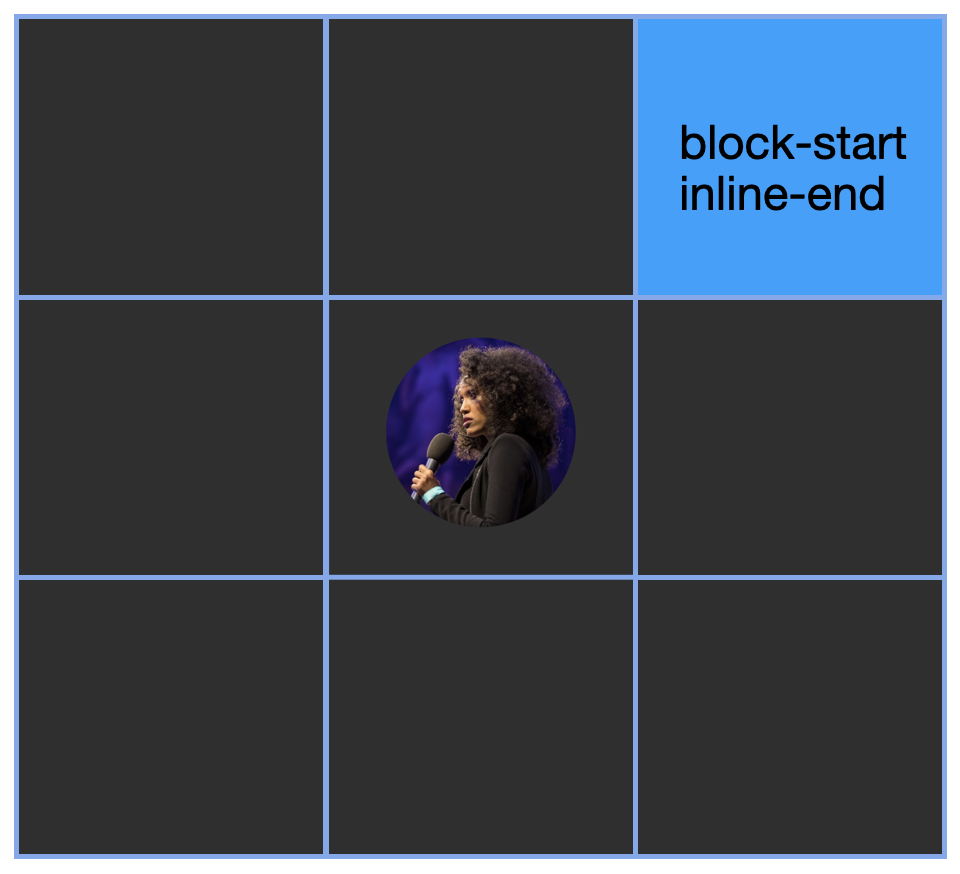
Here’s the same nine-square grid using logical properties:
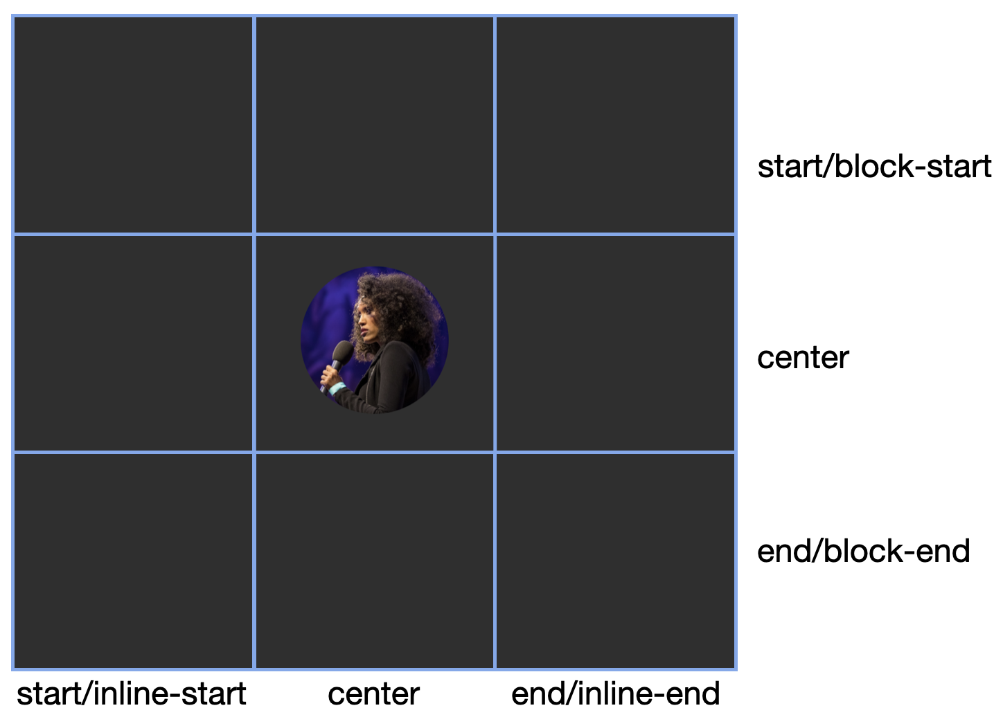
If you rewrite your above physical property as a logical one, you’d go from top right to block-start inline-end, like this:
.profile-menu {
  position-anchor: --profile-button;
  position: absolute;
  position-area: block-start inline-end;
}
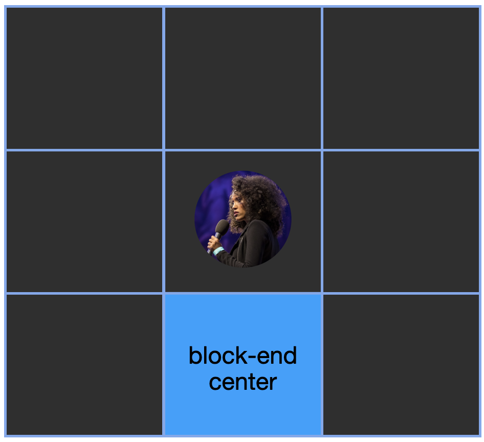
Do you want it to be on the bottom center of your grid? No problem, we’d write that logically as block-end center.
.profile-menu {
  position-anchor: --profile-button;
  position: absolute;
  position-area: block-end center;
}
In your example, you want to put the menu under the avatar, left-aligned, to create that layout you’re going for. But, in this case, there’s a problem: the menu is wider than the avatar. So when you use block-end center as your position-area value, it crosses the grid lines and pokes out like this:

Let’s take the grid lines away and see what that would look like.
That’s not the look you’re going for. How do you get that clean, left-alignment instead?
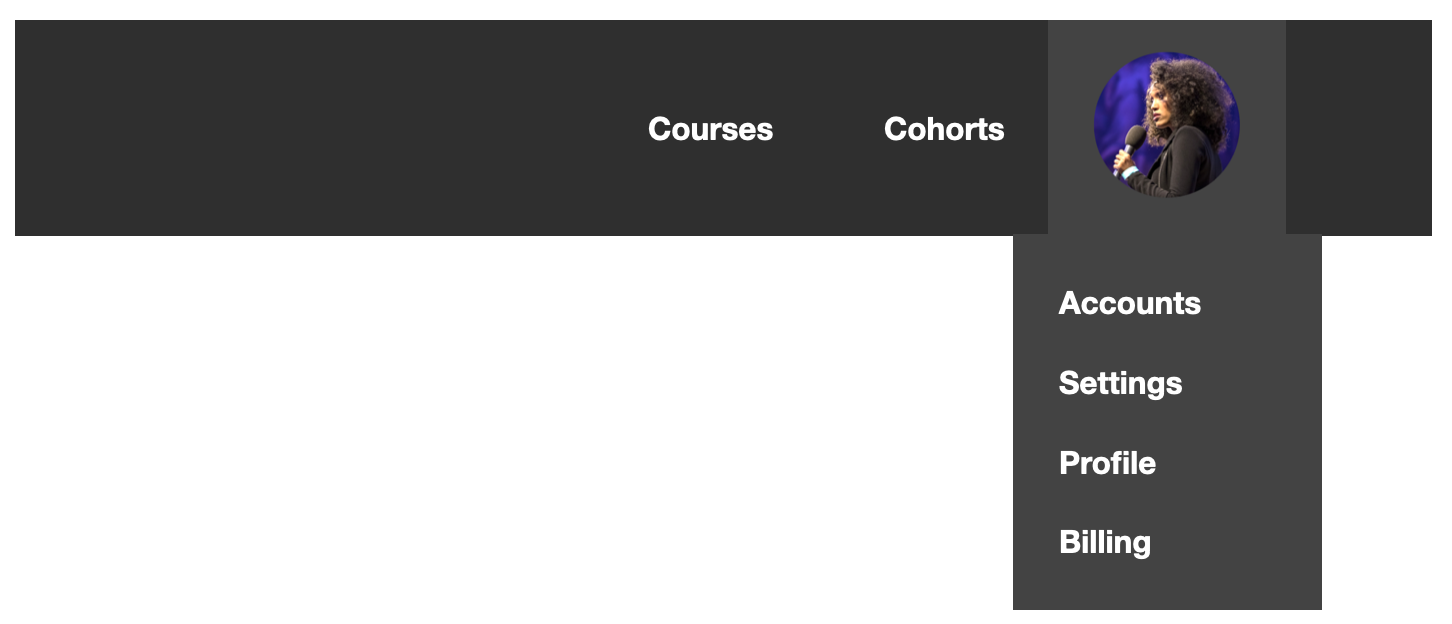
You can set position-area to block-end span-inline-end. Instead of centering the element, that’ll start the position directly below the avatar and let it spill over to end of the inline direction, like this:

And here’s the code:
.profile-menu {
  position-anchor: --profile-button;
  position: absolute;
  position-area: block-end span-inline-end;
}
Great, exactly what you want!
The main logical values you can use are start/block-start, end/block-end, start/inline-start and end/inline-end. And, if you must, you can use the physical values: left, center, right, top, bottom.
For a full list of values you can use, check out MDN’s resource here. Let’s get back to the positioning.
The positioning you set for your menu works on desktop, where you’re got plenty of space on the right for the element to spill over, but what about on mobile where your viewport is more narrow?
In mobile view, it’s probably better to do a right-align and allow the menu to spill over to the left instead. To do that, what we want is a way to tell the menu to switch to a different position when it’s run out of room.
And anchor positioning can do that! The benefit of anchor positioning is you get this responsive flexibility. It knows when there’s no room for your defined position and it’ll happily try something else. So let’s give it a different position to try when it’s out of space. To do that, you’ll use position-try.
Here’s what that looks like:
.profile-menu {
  position-anchor: --profile-button;
  position: absolute;
  position-area: block-end span-inline-end;
  position-try: block-end span-inline-start;
}
position-try allows you to give your element a new position to try, hence the name. Here’s what the results look like in action.
Anchor()
The anchor() function uses a different framework than position-area for placing your target. Whereas position-area uses the concept of a grid to place the target, anchor() is all about placing your target based on the edges of your anchor.
It can only be used within the inset properties. Inset properties allow you to control where the element is located by declaring the offsets from its default positions. They can be the physical insets, which are top , right, bottom, and left, the logical inset properties, which are inset-block-start , inset-block-end, inset-inline-start and inset-inline-end, and the short-hand inset properties, inset-block and inset-inline .
So to recreate the above effect where the left side of the avatar is aligned to the left side of the menu, you would use the left inset property and assign it to anchor(left). Now the two sides are lined up to each other. And then to line up the top of the menu with the bottom of the avatar, you would set the top inset property of the menu to anchor(bottom).
Here’s the code put together:
.profile-menu {
  position-anchor: --profile-button;
  position: absolute;
  left: anchor(left);
  top: anchor(bottom);
}
This uses physical properties, but once again, we really should be using logical properties, so let’s rewrite this.
.profile-menu {
  position-anchor: --profile-button;
  position: absolute;
  inset-inline-start: anchor(start);
  inset-block-start: anchor(end);
}
Here, left and right values are replaced with inset-inline-start and inset-block-start. For the anchor() function, there are a few logical values to pick from. start and end allow you to set the start and end of the anchor’s containing block based on whatever axis the inset property you’re using is on. You also have self-start and self-end which are based on the anchor element’s content instead of its containing block.
anchor() also allows you to be specific about what anchor you’re working with. You can pass in an optional anchor-name and be explicit about your anchor. If you did that here, here’s what it would look like:
.profile-menu {
  position-anchor: --profile-button;
  position: absolute;
  left: anchor(--profile-button left);
  top: anchor(--profile-button bottom);
}
But in this situation, you only have the one anchor, so if you don’t explicitly state it, it’ll use whatever you set as your position-anchor.
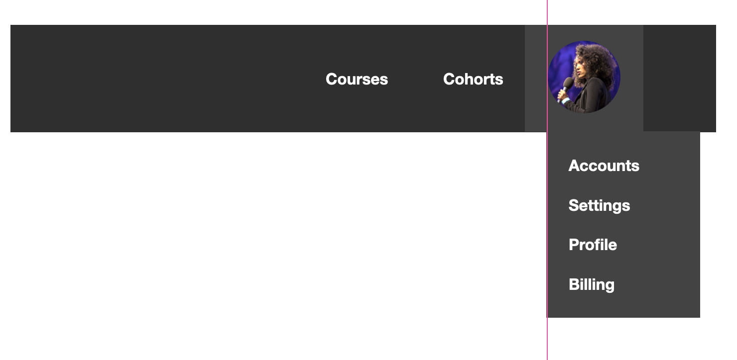
The anchor() function can also be used in the calc() function. So far, you’ve been aligning the menu with the avatar’s container which includes some padding. Let’s say you wanted to align it with just the photo minus the padding, what would you do?
One way is to use the calc() function and add the padding (which is 1.25em) to the anchor(start) value, like this:
.profile-menu {
  position-anchor: --profile-button;
  position: absolute;
  inset-inline-start: calc(anchor(start) + 1.25em);
  inset-block-start: anchor(bottom);
}
That’ll get you this result (the pink line is to illustrate alignment):
position-area and anchor() both help you position your targets based on your anchor. Which one you use depends on your preferred mental model. Thinking of anchor positioning as a grid that you place things on can be a helpful and intuitive way of writing your code. But if you prefer to think of positioning as assigning values to the edges of your anchor, that’s fine too. They can both help you accomplish your goals.
To play around with the different ways to position your target, check out this CodePen I set up for you to experiment. Replace the position-area with your own values and see how the target element moves around. Try to put it in different places and give anchor() a spin too.
There are more things you can do with anchor positioning but the information in this blog post should get you pretty far. For more details on additional properties, checkout MDN’s resource here. You can also check out this fun game, Anchoreum, to teach you anchor positioning.
And let me know what you think of this post. Send me, Saron Yitbarek, a message on BlueSky, or reach out to our other evangelists — Jen Simmons, on Bluesky / Mastodon, and Jon Davis, on Bluesky / Mastodon. You can also follow WebKit on LinkedIn. If you find a bug or problem, please file a WebKit bug report.