Stalking the Statistically Improbable Restaurant… With Data!
Last summer, I wrote about the statistically improbable restaurant, the restaurant you wouldn’t expect to find in a small American city: the excellent Nepali food in Erie, PA and Akron, OH; a gem of a Gambian restaurant in Springfield, IL. Statistically improbable restaurants often tell you something about the communities they are based in: Erie and Akron have large Lhotshampa refugee populations, Nepali-speaking people who lived in Bhutan for years before being expelled from their county; Springfield has University of Illinois Springfield, which attracts lots of west African students, some of whom have settled in the area.
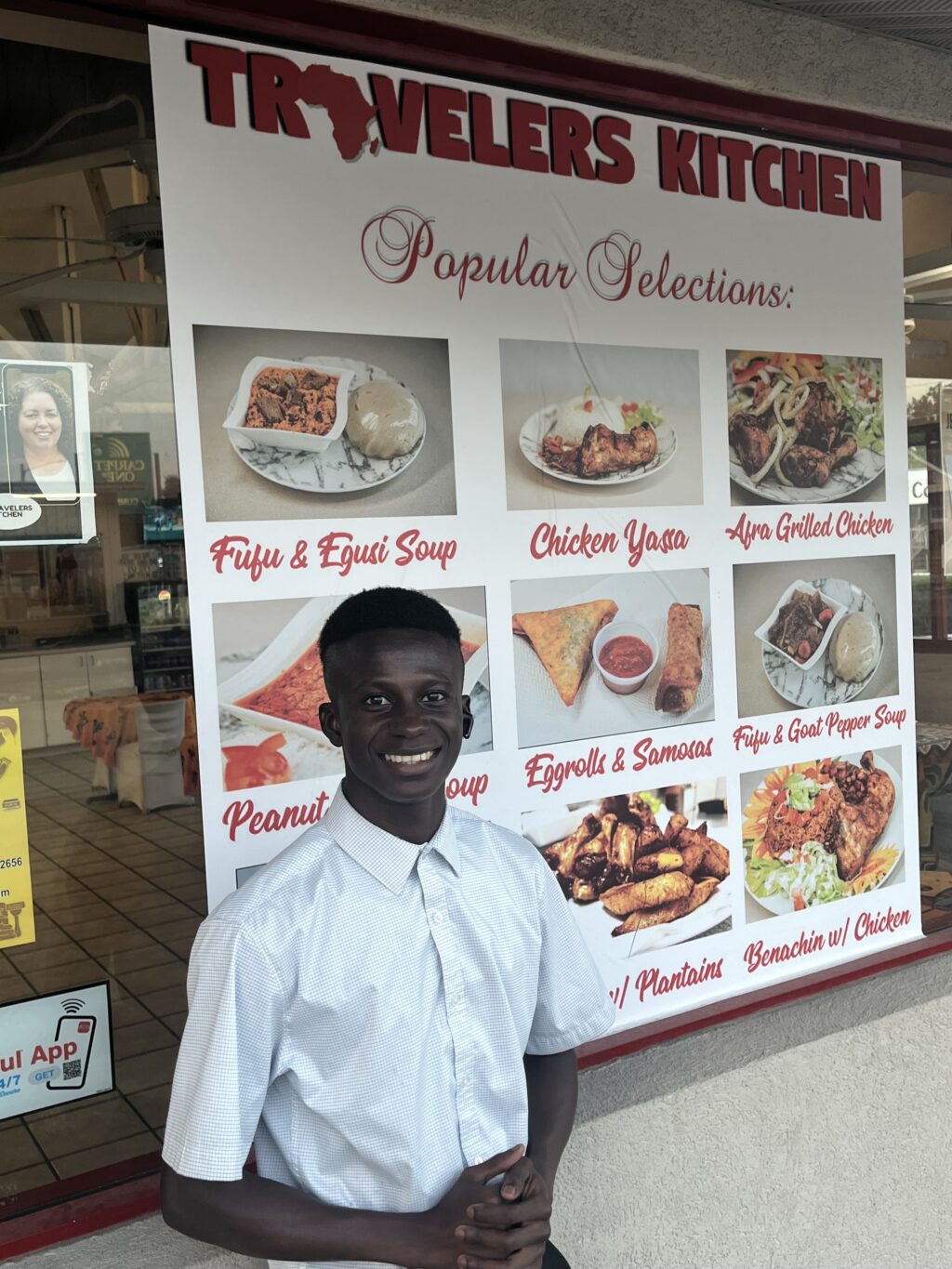
Fine food from The Gambia in Springfield, IL
The existence of the statistically improbable restaurant implies a statistically probable restaurant distribution: the mix of restaurants we’d expect to find in an “average” American city. Of course, once you dig into the idea of an “average” city, the absurdity of the concept becomes clear.
There are 343 cities in the US with populations of over 100,000 people, from 8.47 million in New York City to 100,128 in Sunrise, Florida (a small city in the Ft. Lauderdale, FL metro area). Within that set are global megacities like New York and LA, state capitols, college towns, towns growing explosively and those shrinking slowly.
I’ve retrieved data about the restaurants in 340 of these cities using the Google Places API. This is a giant database of geographic information from across the world – not only does it include information about restaurants, but about parks, churches, museums and other points of interest. The API was designed to make it easy to search by proximity – “return all restaurants within 2km of this point” – but it’s recently gained an “aggregate” attribute, which allows you to ask questions like “How many Mexican restaurants are there in Wichita Falls, Texas?”.
The API is not perfect. I tested my queries on my hometown of Pittsfield, MA and while it got some questions (the number of Dunkin’ Donuts) completely correct, it missed others entirely, failing to identify our two excellent Brazilian restaurants when I searched for that category. We’re going to proceed with the assumption that the data is imperfect, and sanity-check when we get surprising results.

For starters, we look to see whether there’s a relationship between the population of a city and the number of restaurants located within city limits. It seems obvious that New York City should have significantly more restaurants than Lincoln, Nebraska, and indeed, that’s true. When we look at the whole set of cities between 100k – 8 million, there’s a straightforward linear relationship between population and restaurants with a few interesting outliers: Houston has more restaurants than we might expect, Phoenix fewer than we’d anticipate for cities their size.
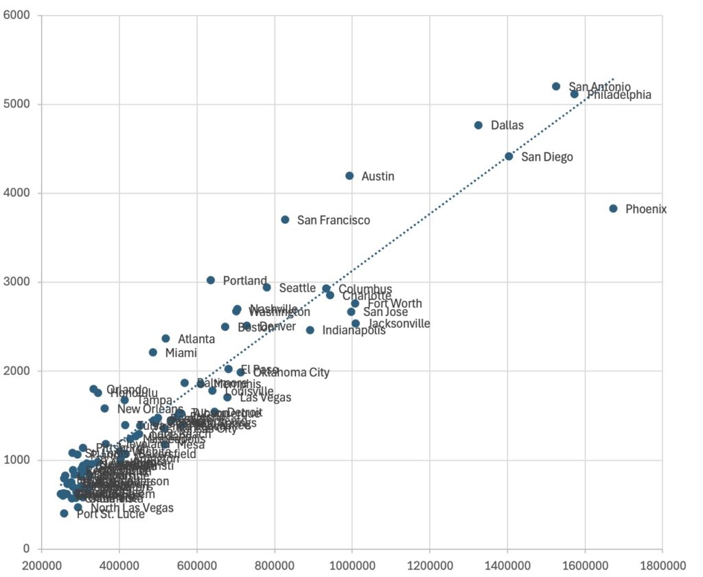
The data is messier as we look at smaller sets of cities. Looking at cities with populations over 250,000, lopping off the four largest US cities (New York, Los Angeles, Chicago, Houston), a linear regression no longer fits as well. Some of the cities that are celebrated for their “creative economies” – Austin, San Francisco, Portland, Seattle, Nashville, Boston – have more restaurants than we might expect, while some less celebrated cities of comparable size – Fort Worth, Jacksonville, Indianapolis, El Paso, Oklahoma City – have fewer than we might expect.

Exploring the cities between 100,000 – 250,000, there’s still a clear relationship between population and the number of restaurants, but that relationship explains just more than half the data variance (R2=0.5333) Some of the cities that are especially restaurant-rich are relatively small capitol cities – Little Rock, AR; Providence, RI; Baton Rouge, LA; Tallahassee, FL – and college towns – Knoxville, TN; Tempe, AZ. Some of the cities that have fewer restaurants than expected are close to larger cities – Cape Coral, FL is next to Fort Meyers; Yonkers, NY is next to New York City; Moreno Valley, CA may be overshadowed by Riverside and San Bernardino.
(These are rough guesses based on staring at scatterplots. I’ll want to try some regressions before positing that capitol cities have a higher than usual number of restaurants because lobbyists need to take legislators out to eat.)
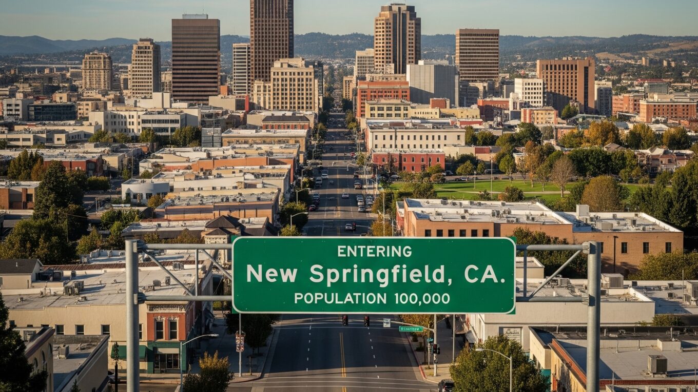
With all this data, we can now imagine an “average” American city of 100,000 people. We’ll call our imagined city “New Springfield, California”. (California has 76 cities with 100,000 or more people, ahead of Texas with 42. There are three Springfields in our set of cities, and 5 cities that start with “New”.)
There are 305 restaurants in New Springfield.
61 (just over 20%) are fast food outlets, including:
9 Starbucks and 4 Dunkin’s
6 McDonalds, 3 Burger Kings and 3 Wendy’s
4 Taco Bells and 2 Chipotles
9 Subways
3 Dominos and 2.5 Chick-Fil-A’s
55 restaurants describe themselves as selling “American” food. Additionally, New Springfield boasts 5 BBQ joints, 5 diners, 12 bar and grills, 22 burger joints, 29.5 pizza parlors, 28 sandwich shops and 5 steakhouses.
122 restaurants offer some sort of “international” cuisine. Mexican is the most numerous with 38 eateries. There are 12.5 Chinese restaurants, 12 that identify as “Asian” (not clear how those categories overlap), 11 Japanese, 3.5 Korean restaurants, 1.5 Ramen bars, 7 sushi restaurants, 4 Thai restaurants and 3.5 Vietnamese places. (Not clear if any have good bahn mi, or just pho.) There are 4.5 “Mediterranean” restaurants, 10 Italian, 1.5 Greek, two Middle Eastern and half a Lebanese place. There are four Indian restaurants, two Brazilian restaurants, and my favorite place has a 47% chance of being African on any given night, a 20% chance of being Afghan and is otherwise likely to be Turkish.
These numbers won’t add up neatly, due to rounding, overlap between restaurants (the combination Pizza Hut and Taco Bell might well be coded as Mexican, Italian and fast food) and the fact that this is an imaginary city based on the distribution of messy and incomplete data. But it gives us a statistically probable city that we can now deviate from.
We can – and will, in just a moment – look at individual variable to discover that Newark, NJ has the highest percentage of African restaurants and that Quincy, MA has the lowest proportion of Mexican restaurants of any American city over 100,000. (If you’ve been to Quincy, that tracks – while the town is not solely white and blue collar as it used to be, there’s been an influx of Asian immigrants and far fewer Latinx immigrants than in Boston’s western suburbs.) For now, we want to ask: which of our 340 cities is the closest to New Springfield, the most “average”.
I represented the restaurant distribution for each city in terms of 41 vectors, each a probability between 0 – 1 that a random restaurant fits within a specific category (Is it fast food? Chinese? A Dunkin Donuts? etc.) The cities closest to the centroid of that vectorspace are Lexington, KY; Colorado Spring, CO; North Charleston, SC; Indianapolis, IN and Columbus, OH. Three of those cities are relatively close to one another (Lexington, Columbus and Indianapolis), suggesting some sort of southern/midwest conceptual center for the nation’s culinary tastes.

(I badly wanted Peoria, IL to be close to the centroid because of the old idea that Peoria was middle American enough to be America’s test market. That old saw hasn’t been true for decades – Peoria hasn’t diversified as quickly as the rest of the US and is no longer demographically average. Interestingly enough, Columbus, OH is one of the cities most mentioned when people look for a demographically representative test city. And in an ironic twist, both Peoria, IL and Peoria, AZ are right in the middle of my centroid ranking, meaning they are right in the middle between being average and being unusual.)
The five cities furthest from the centroid – statistically the five most unusual cities – are a weird mix: South Fulton, GA; Garden Grove, CA; Menifee, CA; Jurupa Valley, CA; and Quincy, MA. All three California cities are in the south of the state, east of Los Angeles. Menifee and Jurupa Valley are part of the “Inland Empire”, while Garden Grove borders on Anaheim. Garden Grove, CA and Quincy, MA have larger Asian populations than many similarly-sized cities, and Jurupa Valley is majority Latinx, not unusual for California, but quite different from the rest of the nation. South Fulton, GA is a suburb of Atlanta. Like Jurupa Valley, CA, it was recently incorporated, which might explain why it’s got the fewest restaurants of any city in our set. (It might also be a data error.)
My centroid calculations currently weigh all vectors equally, despite the fact that some have very little variation, and others have lots. Google’s API has a category for Indonesian restaurants, despite that the fact that the vast majority of US cities don’t have any – removing Indonesian restaurants, for example, might give me more explicable results and help me find clusters of restaurants from the data.
But we don’t care about clusters of cities – we’re looking for statistically improbable food! I’m right there with you, friends.
Our method is quite good at showing us concentrations of restaurants in the categories that Google explicitly tracks. In the average American city, 0.07% of restaurants serve Afghan food. But six California cities – Fremont, Elk Grove, El Cajon, Tracy, Hayward and Concord – boast that at least 1% of their restaurants are Afghan. Fremont, Concord and Hayward are all in the East Bay, inland from San Francisco, and Elk Grove and Tracy in the same general part of the state, suggesting that migrants may well move to parts of the US where there’s an established population of compatriots to open their businesses.
African restaurants are similarly rare – 0.15% of total restaurants in our set. But the cities with high concentrations of African food are more widely distributed. Newark, NJ is well within the orbit of New York City, and Inglewood, CA within LA’s penumbra, and both have attracted African immigrants for whom real estate within the megalopolis is too expensive. The other three cities with more than 1% African restaurants – Minneapolis, MN, St. Paul, MN and Fargo, ND – are well known destinations for migrants from East Africa, particularly Somalis. (Wonderfully, two cities in easy driving distance of me – Albany, NY and Worchester, MA – rank in the top 20 of African restaurant distribution.)
Sometimes what’s interesting is what’s NOT present in a city. The cities with high concentrations of Mexican restaurants are where you would expect them to be – southern California, with a few in the Central Valley; border areas of Texas and New Mexico, the Phoenix suburbs. Mexican food deserts include some very cold places (Rochester and Buffalo, NY), and some cities with large non-Mexican immigrant populations (Arabic speakers in Dearborn, MI, Asian americans in Quincy, MA). Digging into demographic data, I discovered that two Mexican food deserts in Florida are demographically distinct from the Miami area, where both are located. Miami Gardens, FL is 62% African American, down from a decade ago – there’s significant Latinx immigration, but it’s very demographically distinct from Miami, which is 70% Latinx and 12% African American. Sunrise, FL, another Miami area city, has large Jamaican and Haitian populations (as well as a surprising number of Yiddish speakers.)
I had a hypothesis that concentrations of fast food were correlated to poverty. As the data is coming in, I think it may correlate more closely to rapidly growing suburbs – West Jordan, UT (Salt Lake City), North Las Vegas, NV (Las Vegas), Ontario, Rialto and Menafee, CA (Inland Empire/Riverside/San Bernardino) all rank high on that score. Fast food also may inversely correlate to population. Of the twenty largest cities in the US, only four have fast food prevalence over the mean (20.15%): Phoenix (20.85%); Jacksonville (21.72%); Fort Worth (21.53%); Oklahoma City (21.77%).
There’s something of a snob factor going on as well. The nine cities I found with fewer than 10% fast food restaurants are:
San Francisco, CA; Seattle, WA; Portland, OR; Berkeley, CA; San Mateo, CA; Miami, FL; Oakland, CA; Pittsburgh, PA and Honolulu, Hawaii. Four of those cities are in the SF Bay Area, one of the wealthiest and most expensive parts of the country. Neither the Pacific Northwest nor Hawaii are cheap, either.
I’ve got tons more to do with this data. I’m fooling around with k-means clustering, trying to identify emerging patterns. I’ll make my code more efficient and expand this to the cities I am most in love with – the 50k to 100k cities – and see if the overall patterns change. Once I’ve fixed a few more data quality problems, I’ll release a spreadsheet at CSV of the data – if you’d like to play with it in the meantime, let me know.
For now, let me close with a set of top ten lists:
Highest prevalence of fast food:
Menifee, California		35.66%
West Jordan, Utah		35.07%
Rialto, California		32.77%
Ontario, California		32.72%
North Las Vegas, Nevada		32.55%
Fontana, California		32.35%
Independence, Missouri		31.85%
Victorville, California		31.72%
Wichita Falls, Texas		31.50%
Olathe, Kansas			31.44%

Highest prevalence of American restaurants:
Lincoln, Nebraska 		28.29%
Surprise, Arizona		27.54%
Goodyear, Arizona		27.15%
Menifee, California		27.13%
Tuscaloosa, Alabama		26.09%
Lafayette, Louisiana		25.68%
Independence, Missouri		25.56%
Rio Rancho, New Mexico		25.53%
Billings, Montana		25.47%
Moreno Valley, California	25.43%

Highest prevalence of BBQ restaurants:
Shreveport, Louisiana		5.23%
Kansas City, Kansas		4.55%
Chattanooga, Tennessee		4.18%
Columbus, Georgia		4.05%
New Braunfels, Texas		4.01%
Huntsville, Alabama		3.94%
Honolulu, Hawaii		3.87%
Fayetteville, Arkansas		3.85%
Concord, North Carolina		3.84%
Beaumont, Texas			3.74%

Highest prevalence of Bar and Grill restaurants:
Davenport, Iowa			13.73%
Cedar Rapids, Iowa		9.90%
Sioux Falls, South Dakota	9.89%
Madison, Wisconsin		9.42%
Akron, Ohio			9.09%
Evansville, Indiana		8.96%
Manchester, New Hampshire	8.82%
Lee's Summit, Missouri		8.62%
Spokane Valley, Washington	8.60%
Omaha, Nebraska			8.59%

Highest prevalence of diners:
Yonkers, New York		4.30%
Lancaster, California		3.96%
Davenport, Iowa			3.87%
Hesperia, California		3.86%
Mobile, Alabama			3.74%
Rochester, New York		3.64%
Cape Coral, Florida		3.41%
Macon, Georgia			3.40%
Augusta, Georgia		3.37%
Jurupa Valley, California	3.37%

Highest prevalence of burger joints:
Rio Rancho, New Mexico		17.73%
Menifee, California		17.05%
Moreno Valley, California	14.74%
Jurupa Valley, California	13.94%
West Jordan, Utah		13.74%
Victorville, California		13.45%
Yuma, Arizona			13.36%
Fontana, California		12.75%
Nampa, Idaho			12.72%
Surprise, Arizona		12.68%

Highest prevalence of pizza parlors:
Hampton, Virginia		17.70%
Worcester, Massachusetts	17.31%
Lowell, Massachusetts		17.24%
Deltona, Florida		16.96%
Quincy, Massachusetts		16.80%
Newport News, Virginia		16.29%
Chesapeake, Virginia		15.95%
Lynn, Massachusetts		15.52%
Warren, Michigan		15.45%
Virginia Beach, Virginia	15.30%

Highest prevalence of steakhouses:
Billings, Montana		4.09%
Evansville, Indiana		3.54%
Tyler, Texas			3.34%
San Angelo, Texas		3.31%
McAllen, Texas			3.23%
Fort Wayne, Indiana		3.22%
Suffolk, Virginia		3.21%
Davenport, Iowa			3.17%
Shreveport, Louisiana		3.14%
Rockford, Illinois		3.09%

Highest prevalence of Afghan restaurants:
Concord, California		2.01%
Hayward, California		1.74%
Tracy, California		1.68%
El Cajon, California		1.26%
Elk Grove, California		1.18%
Fremont, California		1.01%
West Valley City, Utah		0.65%
Sacramento, California		0.55%
Kent, Washington		0.54%
Antioch, California		0.52%

Highest prevalence of African restaurants:
Newark, New Jersey		2.08%
Inglewood, California		1.85%
Minneapolis, Minnesota		1.62%
Fargo, North Dakota		1.58%
St. Paul, Minnesota		1.20%
Richmond, California		0.93%
Arlington, Texas		0.78%
Menifee, California		0.78%
Worcester, Massachusetts	0.77%
Providence, Rhode Island	0.72%

Highest prevalence of Brazilian restaurants:
Newark, New Jersey		3.96%
Lowell, Massachusetts		3.88%
Worcester, Massachusetts	3.27%
Richmond, California		2.80%
Carlsbad, California		2.33%
Coral Springs, Florida		2.26%
South Fulton, Georgia		2.22%
Huntington Beach, CA		2.18%
Brockton, Massachusetts		2.08%
Orlando, Florida		2.06%

Highest prevalence of Chinese restaurants:
Quincy, Massachusetts		12.70%
Bellevue, Washington		11.18%
Daly City, California		10.58%
Philadelphia, Pennsylvania	10.05%
San Mateo, California		9.92%
Fremont, California		9.92%
Sunnyvale, California		9.07%
San Francisco, California	9.05%
New York, New York		8.80%
El Monte, California		8.50%

Highest prevalence of Greek Restaurants:
Carmel, Indiana			2.33%
Boca Raton, Florida		1.82%
Alexandria, Virginia		1.75%
Tempe, Arizona			1.74%
Lee's Summit, Missouri		1.72%
Cincinnati, Ohio		1.71%
Salt Lake City, Utah		1.66%
Stamford, Connecticut		1.64%
High Point, North Carolina	1.64%
Manchester, New Hampshire	1.63%

Highest prevalence of Indian Restaurants:
Sunnyvale, California		16.95%
Fremont, California		13.77%
Irving, Texas			9.82%
Tracy, 	California		8.40%
Santa Clara, California		8.07%
Frisco, Texas			8.00%
Jersey City, New Jersey		7.36%
Cary, 	North Carolina		7.09%
Naperville, Illinois		6.34%
Bellevue, Washington		6.30%

Highest prevalence of Indonesian Restaurants:
West Covina, California		0.71%
Torrance, California		0.40%
El Monte, California		0.40%
Inglewood, California		0.37%
Albany, New York		0.30%
Sugar Land, Texas		0.27%
Round Rock, Texas		0.26%
Oceanside, California		0.23%
Rancho Cucamonga, CA		0.22%
Philadelphia, Pennsylvania	0.20%
(NB: Indonesian restaurants are quite uncommon in the US - that 0.3% in Albany, NY represents a single restaurant.)

Highest prevalence of Italian Restaurants:
Boca Raton, Florida		11.62%
Stamford, Connecticut		10.38%
Yonkers, New York		9.31%
Worcester, Massachusetts	9.04%
Scottsdale, Arizona		8.80%
Boston, Massachusetts		8.25%
Coral Springs, Florida		7.74%
New Haven, Connecticut		7.39%
Pompano Beach, Florida		7.38%
Palm Coast, Florida		6.76%

Highest prevalence ofJapanese Restaurants:
Torrance, California		15.59%
Honolulu, Hawaii		15.32%
San Mateo, California		13.32%
Costa Mesa, California		12.85%
Berkeley, California		11.04%
Federal Way, Washington		9.34%
Bellevue, Washington		9.15%
Irvine, California		9.09%
Elk Grove, California		8.53%
San Francisco, California	8.34%

Highest prevalence of Korean Restaurants:
Carrollton, Texas		14.67%
Federal Way, Washington		12.45%
Santa Clara, California		8.74%
Garden Grove, California	8.20%
Irvine, California		7.75%
Fullerton, California		7.46%
Ann Arbor, Michigan		5.14%
Honolulu, Hawaii		5.13%
Killeen, Texas			4.40%
Torrance, California		4.25%

Highest prevalence of Lebanese Restaurants:
Dearborn, Michigan		4.73%
Sterling Heights, Michigan	2.08%
Miramarm Florida		1.44%
Toledo, Ohio			1.29%
Paterson, New Jersey		1.28%
Richardson, Texas		1.19%
Downey, California		1.07%
Anaheim, California		1.03%
Peoria, Illinois		0.95%
Lafayette, Louisiana		0.91%

Highest prevalence of Mediterranean Restaurants:
Glendale, California		8.08%
Burbank, California		5.97%
Richardson, Texas		5.93%
Sterling Heights, Michigan	5.88%
Dearborn, Michigan		5.68%
Plantation, Florida		4.12%
Irvine, California		3.43%
Pasadena, California		3.38%
Tempe, Arizona			3.36%
Warren, Michigan		3.33%

Highest prevalence of Mexican Restaurants:
Jurupa Valley, California	32.69%
Santa Ana, California		29.71%
Buckeye, Arizona		29.55%
Oxnard, California		28.91%
Pasadena, Texas			27.66%
Santa Maria, California		27.62%
El Monte, California		27.53%
Salinas, California		27.07%
Brownsville, Texas		26.51%
Laredo, Texas			26.46%

Highest prevalence of Middle Eastern Restaurants:
Sterling Heights, Michigan	7.96%
Dearborn, Michigan		7.57%
Glendale, California		5.27%
Paterson, New Jersey		4.04%
Anaheim, California		3.08%
Burbank, California		2.99%
El Cajon, California		2.93%
Warren, Michigan		2.73%
Richardson, Texas		2.57%
Plantation, Florida		2.47%

Highest prevalence of Ramen Bars:
Honolulu, Hawaii		2.45%
San Mateo, California		2.35%
Elk Grove, California		2.06%
Cambridge, Massachusetts	2.05%
Torrance, California		2.02%
Tempe, Arizona			2.01%
Fullerton, California		1.99%
Coral Springs, Florida		1.94%
Daly City, California		1.92%
Costa Mesa, California		1.89%

Highest prevalence of Spanish Restaurants:
Elizabeth, New Jersey		3.95%
Newark, New Jersey		2.40%
Lynn, Massachusetts		2.30%
Yonkers, New York		1.91%
Paterson, New Jersey		1.91%
Hialeah, Florida		1.86%
Rochester, New York		1.73%
Albany, New York		1.51%
Jersey City, New Jersey		1.45%
Worcester, Massachusetts	1.35%
NB: I strongly suspect that "Spanish" is shorthand for "Latin", and includes Puerto Rican, Dominican, Cuban etc., knowing some of these cities well.

Highest prevalence of Sushi Restaurants:
San Mateo, California		6.79%
Simi Valley, California		6.32%
Costa Mesa, California		5.67%
Roseville, California		5.58%
Coral Springs, Florida		5.48%
Boca Raton, Florida		5.24%
Honolulu, Hawaii		5.18%
Pembroke Pines, Florida		5.15%
Davie, Florida			5.06%
Berkeley, California		5.00%

Highest prevalence of Thai Restaurants:
St. Paul, Minnesota		5.67%
Portland, Oregon		4.97%
Amarillo, Texas			4.63%
Berkeley, California		4.58%
Vancouver, Washington		4.12%
Seattle, Washington		4.08%
Anchorage, Alaska		3.74%
Alexandria, Virginia		3.71%
Tacoma, Washington		3.57%
Lowell, Massachusetts		3.45%

Highest prevalence of Turkish Restaurants:
Paterson, New Jersey		2.77%
Plantation, Florida		1.65%
El Cajon, California		1.26%
Richardson, Texas		1.19%
Waterbury, Connecticut		0.99%
Daly City, California		0.96%
West Jordan, Utah		0.95%
Dearborn, Michigan		0.95%
Kent, Washington		0.82%
Bridgeport, Connecticut		0.76%

Highest prevalence of Vietnamese Restaurants:
Garden Grove, California	21.12%
San Jose, California		6.44%
Renton, Washington		5.71%
Federal Way, Washington		4.67%
Tacoma, Washington		4.46%
El Monte, California		4.45%
Kent, Washington		4.36%
Garland, Texas			4.18%
Everett, Washington		3.49%
Lowell, Massachusetts		3.45%

Finally, some grossly over simplified, aggregate states

Highest prevalence of "domestic" cuisine, including "American", diners, pizza, burgers, bar and grills,steakhouses:

Davenport, Iowa	        76.76%
Billings, Montana	75.16%
Goodyear, Arizona	74.66%
Evansville, Indiana	74.30%
Surprise, Arizona	73.92%
Springfield, Illinois	72.52%
Spokane Valley, WA	72.39%
Rio Rancho, New Mexico	71.64%
Suffolk	, irginia	71.55%
Lee's Summit, Missouri	71.11%

Highest prevalence of "international" cuisine, including all restaurants that mention a specific non-US nationality, plus sushi/ramen:

San Mateo, California	71.83%
Federal Way, Washington	68.86%
Sunnyvale, California	67.07%
Garden Grove, CA        67.00%
Santa Clara, California	62.77%
Berkeley, California	62.49%
Fremont, California	62.14%
San Francisco, CA	61.40%
Bellevue, Washington	61.39%
Costa Mesa, California	61.26%
So very many disclaimers apply:
– Some of this data is guaranteed to be wrong. Some will be wrong because Google’s knowledge of US restaurants is imperfect. Some will be wrong because my code got something wrong. I welcome your “that can’t possibly be right” comments, but won’t be fixing rankings or code in response to them.
– There’s a small set of cities with populations over 100,000 who I had consistent problems getting accurate data for. They’ve been removed from the data set. (They know who they are.) I think this is a Google Places API problem but remain open to the idea that it’s my particular stupidity.
– These categories don’t make sense! Aren’t all the pizza places Italian restaurants! What the hell’s the difference between a Lebanese, Middle Eastern and Mediterranean restaurant? Yep. This one’s on Google – those are the categories I have access to. I strongly suspect they overlap, and it’s not clear whether restaurants self-categorize or are somehow categorized into these buckets.
– Where are the Uighur, Burmese and Peruvian places? Again, blame Google and its categories. I, for one, would welcome an app that told me how many miles I am from Uighur food at all times, and how to alter my driving so I can detour to eat cumin lamb. But so far, this is what I have easy access to. My next version of the tool is going to search for specific terms – “Uighur”, “Xinjiang”, “Ughyur”, etc. – in hopes of identifying some of my favorite cuisines.
Lastly, the code that I used for this analysis was written almost solely by Google Gemini, which was an experience in and of itself. I’ll post about that at a later date.